The contrast is not just about style trends. Psychologists and vision researchers agree that the colours we wear and surround ourselves with quietly influence how old we appear to others, and even how old we feel inside. Far from being a minor aesthetic choice, colour interacts with how the brain processes light, emotion and age.
The subtle power of colour on mood and perceived age
At its core, colour begins as physics: light strikes an object, reflects at a specific wavelength, and our eyes translate that signal. But the brain never treats these wavelengths as neutral. Instead, it layers them with emotion, memory and cultural meaning.
In daily life, colour acts like a quiet filter on faces and environments, nudging impressions toward either fresh and lively or tired and dated without us realising.

Research in environmental and consumer psychology shows that people repeatedly associate certain hues with youth, warmth and activity, while others signal seriousness, distance or fatigue. This is why one outfit can feel like a “holiday selfie”, while another suddenly looks like a passport photo taken a decade ago.
 When kindness becomes isolating: 7 reasons why kind women have fewer friends as they get older
Warm and cool tones: two psychological territories
On the colour spectrum, warm shades such as red, orange and yellow sit on longer wavelengths. They are commonly linked to fire, sunlight, body heat and social closeness.
Cool shades like blue, green and many purples fall on shorter wavelengths, evoking water, shade, calm and emotional distance.
- Warm colours: energy, stimulation, approachability, intensity
- Cool colours: calm, control, distance, sophistication
- Neutrals (black, grey, beige, taupe): stability, discretion, seriousness
People often reach for warm tones when they want to look animated, and cooler ones when they aim for composure. However, as we age, our visual system changes, and colours may no longer register as we expect.
How ageing eyes alter colour perception
Medical research indicates that from roughly ages 60 to 70, the eye’s lens often thickens and yellows. Contrast sensitivity drops, and similar shades become harder to distinguish. Blues may appear duller, and differences between tones such as navy and violet or yellow and light green can blur together.
This does not mean colour disappears with age. Instead, many people drift toward darker, safer or more muted palettes because they feel clearer and more dependable.
When subtle shades become difficult to separate, wardrobes and interiors often shift toward neutrals and dark tones, quietly building a more serious and ageing look without any conscious intention.
Why darker palettes quietly take over
This visual shift helps explain why closets sometimes turn into long lines of black, brown and grey. It is rarely a deliberate choice to look older, but rather a response to what feels visually reliable.
Colours that commonly add years
Black: elegant, but often unforgiving
Black is strongly associated with authority, elegance and formality. It can also signal mourning, distance or mystery. Under harsh lighting or on camera, solid black near the face often emphasises shadows, lines and hollows.
On younger skin, this contrast can appear dramatic. On more mature faces, it may harden features and deepen tired areas.
Flat greys and lifeless taupes
Mid-greys and certain cool taupes are praised as timeless, yet when they lack depth they can feel withdrawn and low-energy. If a grey clashes with someone’s natural colouring, it may drain warmth from the cheeks and lips.
Colours without vibrancy often echo fatigue, quietly reinforcing the signs of a poor night’s sleep.
Very dark, muted shades
Deep browns, bottle greens and murky blues can be beautiful in moderation. Worn head-to-toe or paired with dim lighting and heavy fabrics, they create what stylists call visual weight.
This weight can project authority in professional settings, but socially it often reads as older, stricter and less approachable.
Overly dusty pastels
Pastels are often marketed as softening, and some truly are. However, shades that are both pale and heavily greyed out—such as dusty mauve, faded salmon or washed lavender—can appear stale rather than gentle.

On skin with low contrast, these colours may blend into the complexion, blurring facial definition and creating an impression of fragility instead of freshness.
Colours linked with youth and vitality
Clear, lively warm shades
Psychological studies consistently connect bright reds, corals, peaches and clear yellows with energy and sociability. These hues echo natural signs of health, such as circulation and warmth.
Even a small amount of clear warmth near the face can make features appear more awake and engaged.
Fresh blues and greens
Not all cool tones are ageing. Shades like sky blue, teal and certain emeralds feel clean and oxygenated, similar to fresh air or water.
They often brighten dull complexions and project clarity and modernity rather than distance.
Thoughtful use of white and off-white
White reflects light back onto the face, softening shadows. For many skin tones, warmer off-whites such as ivory, cream or ecru are more flattering than stark optical white.
Light collars and tops act like built-in reflectors, reducing the appearance of fine lines and under-eye darkness.
Choosing colours that refresh rather than age
Focus colour near the face
The brain processes faces first. This makes tops, scarves, glasses and jewellery far more influential than shoes or trousers.
Dark bottoms can stay. Adding light or warmth near the face does most of the visual work.
Simple at-home colour testing
No stylist is required. Stand in daylight with your hair pulled back and minimal makeup. Hold different colours under your chin and notice the changes.
- If your eyes look brighter and lips clearer, the colour likely enhances youthfulness.
- If shadows deepen or you feel the need for more concealer, the shade probably adds years.
Taking quick photos under the same light can also reveal which colours flatten the face and which bring it forward.
Beyond clothing: colour in daily spaces
The same principles apply to homes and workspaces. Rooms dominated by dark woods, heavy browns and dull greys feel older and heavier than spaces balanced with lighter walls, soft greens or fresh blues.
On video calls, background colour directly affects how tired or alert a face appears. Slightly warm, light backgrounds tend to be far more forgiving than dark or icy tones.
Small changes with visible impact
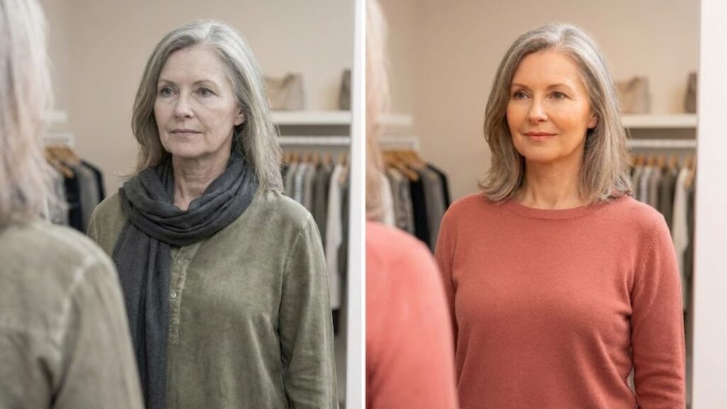
Picture a familiar scenario: a person in their late fifties wearing a grey suit and black turtleneck under low indoor light. The cool, dark palette mirrors under-eye shadows. Replace the black with a soft ivory top and add a teal accent, and the same face often looks immediately more awake.
Or consider a living room filled with dark leather and heavy curtains. Swapping just the cushions for clear blues and warm yellows, and adding a lighter throw, can change how old the space feels—and how you feel in it.

Colour psychology does not replace sleep, health or skincare. But used intentionally, it can soften or amplify what is already there, offering a simple, low-cost way to shift how age is perceived by others and by ourselves.
 People Who Never Make Their Bed Have This Rare, Sought-After Trait, According To Psychology
| Colour choice | Tends to age when… | Tends to rejuvenate when… |
|---|---|---|
| Black | Worn head-to-toe, close to the face, in harsh light | Used in smaller blocks, away from the face, with brighter accents |
| Grey | Flat, cool mid-greys dominating the outfit | Soft greys mixed with white, denim blue or a warm accent |
| Red / orange | Too dark (burgundy, rust) and paired only with black | Clear coral, tomato, or warm orange near the face |
| Blue | Very dark navy with no contrast | Sky blue, teal or bright navy with light neutrals |
| Pastels | Dusty, greyed-out, similar to skin tone | Clean, slightly brighter versions with a hint of warmth |